Best Practices for Matching Data with Appropriate Charts in Microsoft Excel

Best Practices for Matching Data with Appropriate Charts in Microsoft Excel
Quick Links
- Excel Charts for Comparison Data
- Excel Charts for Composition Data
- Excel Charts for Distribution Data
- Excel Charts for Trend Data
- Other Types of Charts in Excel
- More Help Choosing a Chart
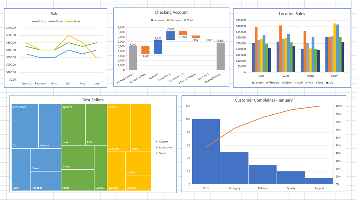
If you want to add a visual to your Excel spreadsheet that summarizes data at a glance, a chart is perfect. Depending on the type of data you have, however, it can be difficult to know which chart fits the best.
Here, we’ll look at different types of data and the charts available in Microsoft Excel. In some cases, you may have more than one type of chart that suits your data just fine. But in others, there may be only one option.
We’ll break down the types of charts and corresponding data into four categories: Comparison, Composition, Distribution, and Trends.
Excel Charts for Comparison Data
When you want to compare one set of data to another, you have several chart types that work. Some depend on the number of data sets while others use a hierarchical structure. For example, you might compare income from various sources or performance in categories for an employee review.
For displaying comparisons, you can use one of these chart types:
- Column or Bar: Use with two or more data points to show relational differences between categories.
- Treemap: Use to show a hierarchical comparison with rectangles.
- Sunburst: Use to show a hierarchical comparison with rings.
- Scatter: Use with at least two data sets when the data signifies measurements.
- Bubble: Use with at least three data sets when the third set determines the bubble sizes.
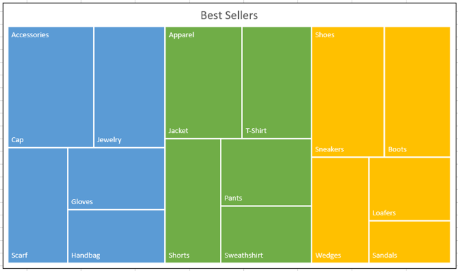
Related: How to Create and Customize a Treemap Chart in Microsoft Excel
Excel Charts for Composition Data
If you want to show parts of a whole, you can use a composition chart. You might show the percentage of sales for each salesperson, visits to a website based on location, or each division’s contribution to revenue, all in relation to the total.
For displaying parts of a whole, you can use one of these chart types:
- Pie: Use with one data series where the whole equals 100 percent.
- Doughnut: Use with more than one data series where each relates to a larger amount.
- Stacked Column, Bar, or Line: Use to display parts of a whole that change over time.
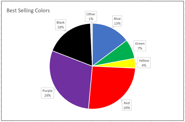
Related: How to Make a Pie Chart in Microsoft Excel
Excel Charts for Distribution Data
If you want to display how a large data set is disseminated, use a distribution chart. This type of graph works well for things like survey results based on age, frequency of complaints in a call center, or test scores across schools.
For displaying the distribution of data, you can use one of these chart types:
- Histogram: Use to show the frequency of values sorted into bins.
- Pareto: Use to show the relative portion for each category to the total and include significant factors.
- Scatter: Use to show relationships between data sets.
- Box and Whisker: Use to show variations within multiple data sets and their relationships. The chart uses quartile, median, minimum, and maximum values.
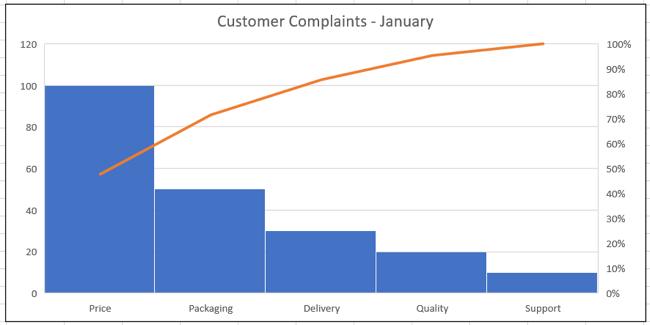
Related: How to Create and Customize a Pareto Chart in Microsoft Excel
Excel Charts for Trend Data
When you think of trends, these are things that change over time. For instance, styles of jeans change throughout the decades. You had bell-bottoms in the 70s, high-waisted in the 80s, button-fly in the 90s, and so on.
For displaying data that changes over time, you can use one of these chart types:
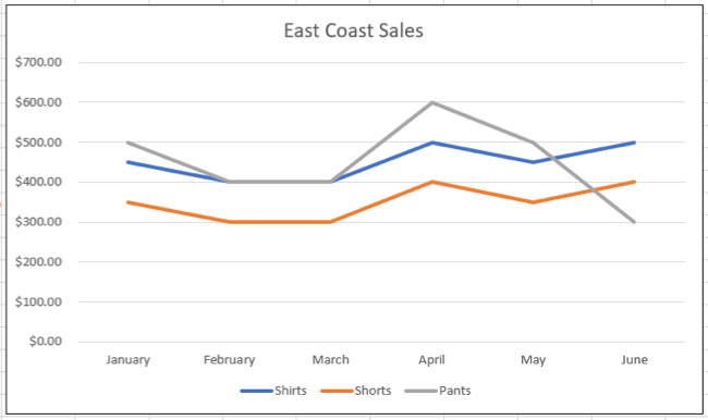
- Line: Use with multiple data points to show trends over days, months, years, or similar timeframes, or by category.
- Area: Use instead of a line chart to emphasize the degree of change over time.
- Column or Bar: Use to show values across days, months, or years.
Related: How to Make a Curved Graph in Excel
Other Types of Charts in Excel
There is a handful of other charts in Excel that work for one-off situations and might also fit your data.
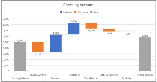
- Waterfall: Use to show positive and negative effects to values.
- Funnel: Use to show decreasing stages in a process.
- Surface: Use to show optimum trends or relations in values across dimensions.
- Radar: Use to show values in relation to a center point.
Related: How to Create and Customize a Waterfall Chart in Microsoft Excel
More Help Choosing a Chart
While the above are the most common types of charts to use for the kind of data you have, these aren’t hard and fast rules. You can certainly use a different type of graph or chart if you feel it represents your data well.
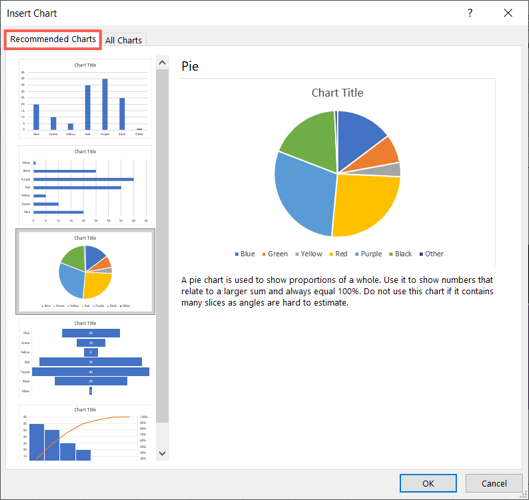
In addition, Excel can actually help you pick the right graph with its Recommended Charts feature. To use the tool, select the data you want to plot in a chart. Then, head to the Insert tab and click “Recommended Charts” in the Charts section of the ribbon.

Excel will analyze your data and provide recommendations in the Insert Chart window. On the Recommended Charts tab, you can review the suggestions on the left and then check out a preview and brief description on the right. If you see a chart you want to use, click “OK” to pop it into your spreadsheet.
This information gets you one step closer to choosing the right chart for your data in Excel.
Related: How to Use the Analyze Data Feature in Microsoft Excel
Also read:
- [New] 2024 Approved End-Screen Design Made Easy with Our Templates & Tutorials
- [New] In 2024, Jestful Joymaker Online
- [New] Reinforcing Photo Viewing Functionality with Windows 10 Solutions
- [Updated Version Available!] HP Photosmart 7520 Printer Driver Download Guide
- Download and Install Logitech Driving Force Pro Controls on Your PC – Windows Supported Versions
- Effortless Driver Downloads and Updates for Your Surface Book: Learn How Today
- Epson XP-640 Driver Update on Windows
- Exploring Pronunciation Fundamentals in German
- Fix Realtek 8821AE Wireless LAN 802.11Ac PCI-E NIC Driver Issue
- Free Download: Ultimate Driver Pack for Microsoft's Latest Laptop
- How to Correctly Install LG's USB Driver for Seamless Windows Compatibility (Windows 11, 8 & 7)
- In 2024, GoPro Video Editing Simplified A Beginners Guide to Amazing Results
- In 2024, Premium 8 Editors Compatible with Linux
- Pocket-Sized Picture Playwriting
- Understanding and Fixing 'Cygwin1.dll Not Found' Issues on Your PC
- Title: Best Practices for Matching Data with Appropriate Charts in Microsoft Excel
- Author: Charles
- Created at : 2024-11-30 12:31:11
- Updated at : 2024-12-05 21:04:05
- Link: https://win-amazing.techidaily.com/best-practices-for-matching-data-with-appropriate-charts-in-microsoft-excel/
- License: This work is licensed under CC BY-NC-SA 4.0.