
Step-by-Step Guide: Inserting Axis Labels and Titles Into Your Microsoft Excel Charts

Step-by-Step Guide: Inserting Axis Labels and Titles Into Your Microsoft Excel Charts
Quick Links
- Add Axis Titles to a Chart in Excel
- Customize the Axis Titles on a Chart
- Remove Axis Titles From a Chart
There are plenty of ways to customize a chart you create in Excel . If you want to make sure your chart is clear to those viewing it, you can add vertical or horizontal axis titles and customize those too.
Add Axis Titles to a Chart in Excel
Select your chart and then head to the Chart Design tab that displays. Click the Add Chart Element drop-down arrow and move your cursor to Axis Titles. In the pop-out menu, select “Primary Horizontal,” “Primary Vertical,” or both.
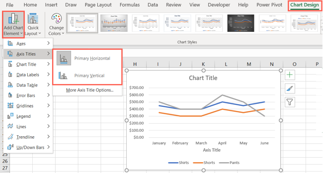
If you’re using Excel on Windows, you can also use the Chart Elements icon on the right of the chart. Check the box for Axis Titles, click the arrow to the right, then check the boxes for the horizontal, vertical, or both titles.

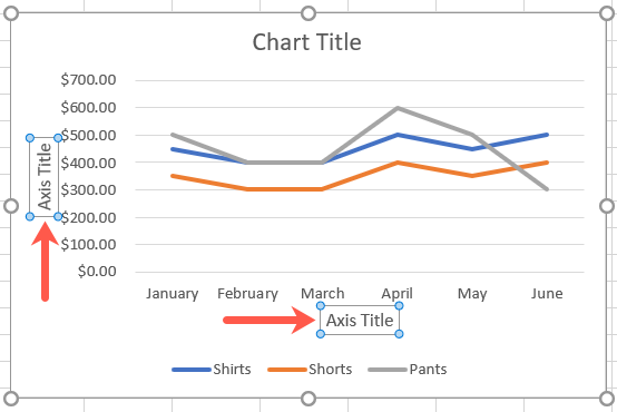
When the axis title you select appears on the chart, it has a default name of Axis Title. Select the text box containing the default title and add your own.
Related: How to Create a Combo Chart in Excel
Customize the Axis Titles on a Chart
You can customize both the axis title boxes and the text within those boxes. And you have a few different ways to go about it.
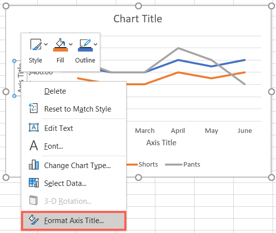
First, right-click an axis title to display the floating toolbar. You’ll see options for Style, Fill, and Outline.
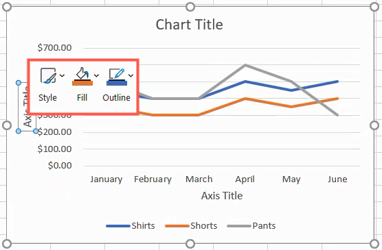
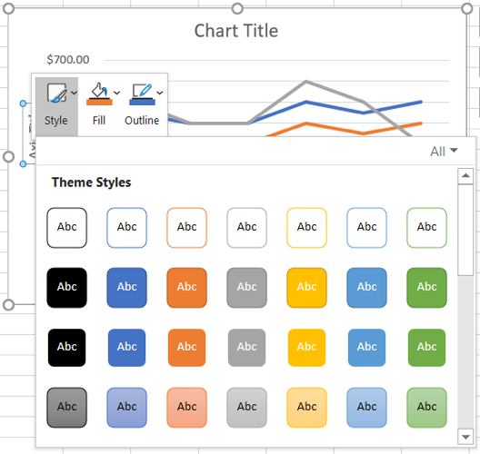
Use the drop-down arrows next to any of these options to apply a theme, use a gradient or texture, or choose a border style and color.
To take your customization a bit further, start by opening the Format Axis Title sidebar. You can either right-click a title and select “Format Axis Title” or double-click one of the titles.
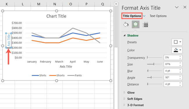
At the top of the sidebar, make sure you see Title Options. Then use the three tabs directly below it for Fill & Line, Effects, and Size & Properties to make your adjustments.
You can do things like change the fill or border, add a shadow or glow, or adjust the alignment.
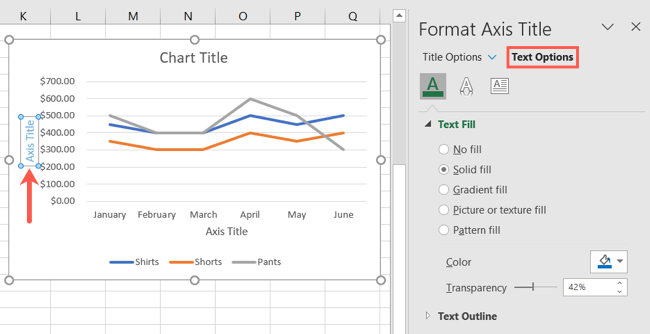
To customize the font, select Text Options at the top of the sidebar. Then use the tabs for Text Fill & Outline, Text Effects, and Text box.
You can then do things like change the font color or transparency, use a 3-D format, or change the text direction.
Related: How to Create a Geographical Map Chart in Microsoft Excel
Remove Axis Titles From a Chart
If you decide later to remove one or both axis titles, it’s just as easy as adding them.
Select the chart and go to the Chart Design tab. Click the Add Chart Element drop-down arrow, move your cursor to Axis Titles, and deselect “Primary Horizontal,” “Primary Vertical,” or both.

In Excel on Windows, you can also click the Chart Elements icon and uncheck the box for Axis Titles to remove them both. If you want to keep one title, use the arrow next to Axis Titles and mark the one you want.

If you’re looking for help with a particular graph, take a look at how to create and customize a waterfall chart or a funnel chart in Microsoft Excel .
Also read:
- [New] 2024 Approved Chromebook's Best Capture Tools (No Cost)
- [New] Take Control How to Involve Yourself in a Friend's Live on TikTok for 2024
- [New] TikTok User Birthday Visualization Pixels, Type, Elapsed for 2024
- [Updated] 2024 Approved Bringing Rhythm to Instagram's Visual Narratives
- Exploring NVIDIA's AI Foundation: An Insight Into Their Custom Generative AI Platform
- How To Install Epson XP-430 Printer Drivers On Your Windows PC: A Comprehensive Guide
- In 2024, High-End Humor Scripts
- Latest Dell G15 Graphic Card Drivers Free - Compatible with Windows OS
- Latest NVIDIA GeForce GTX 1650 Super Drivers: Free Downloads for Windows 10/11 Users
- Quick & Easy Guide to Updating Asus VG24#qe Display Driver on Windows PCs - What You Need to Know!
- Quick Guide: Downloading and Updating ScanSnap S1300i Software
- Top 10 Smartphone VR Gadgets Uncovered for 2024
- Windows 10/7 FWU Drivers - AOC Release V1659E
- Your Account Has Been Disabled in the App Store and iTunes From Apple iPhone SE (2022)?
- Title: Step-by-Step Guide: Inserting Axis Labels and Titles Into Your Microsoft Excel Charts
- Author: Charles
- Created at : 2024-11-29 16:41:56
- Updated at : 2024-12-05 18:13:48
- Link: https://win-amazing.techidaily.com/step-by-step-guide-inserting-axis-labels-and-titles-into-your-microsoft-excel-charts/
- License: This work is licensed under CC BY-NC-SA 4.0.